Click Competitions is a UK prize-competition platform where players buy entry tickets from as little as 1p for a chance to win cars, cash and tech. The studio I work for acquired it live, with 220,000+ active users. In two months I led a rework of the entire platform: rebuilding the broken checkout and adding the capabilities it never had, without dropping a single user. This case study zooms in on the three highest-impact flows.
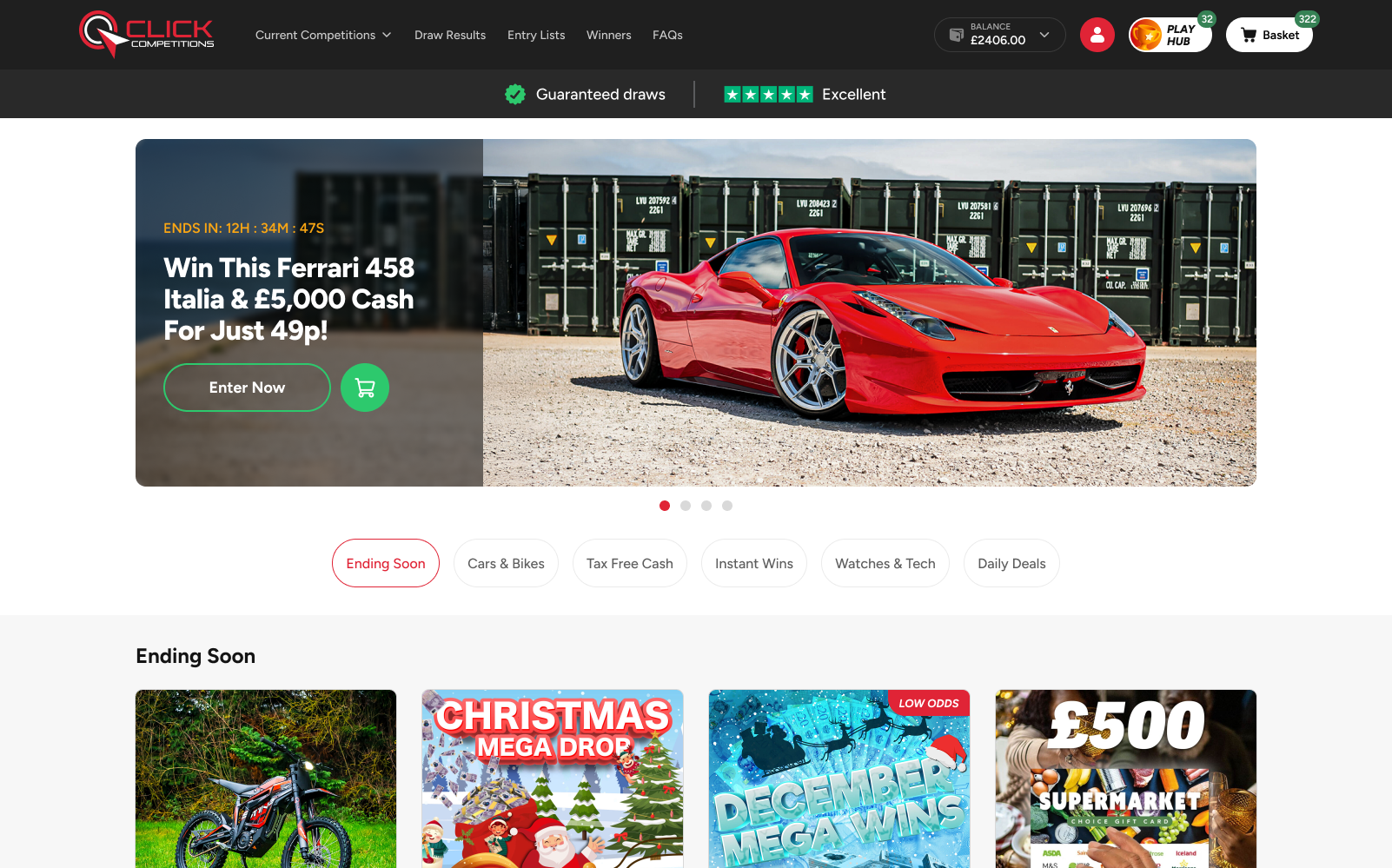
Click runs two competition types: regular prize draws and Instant Wins, where the result is revealed the moment you buy. Tickets are cheap and the thrill is immediate, which is exactly why people come back.
The studio I work for bought it at the start of the year, underperforming but alive. That changes the job entirely. There was no greenfield, no staging-only audience, no permission to pause. Every change had to ship under real traffic, real money, and real winners mid-flight.
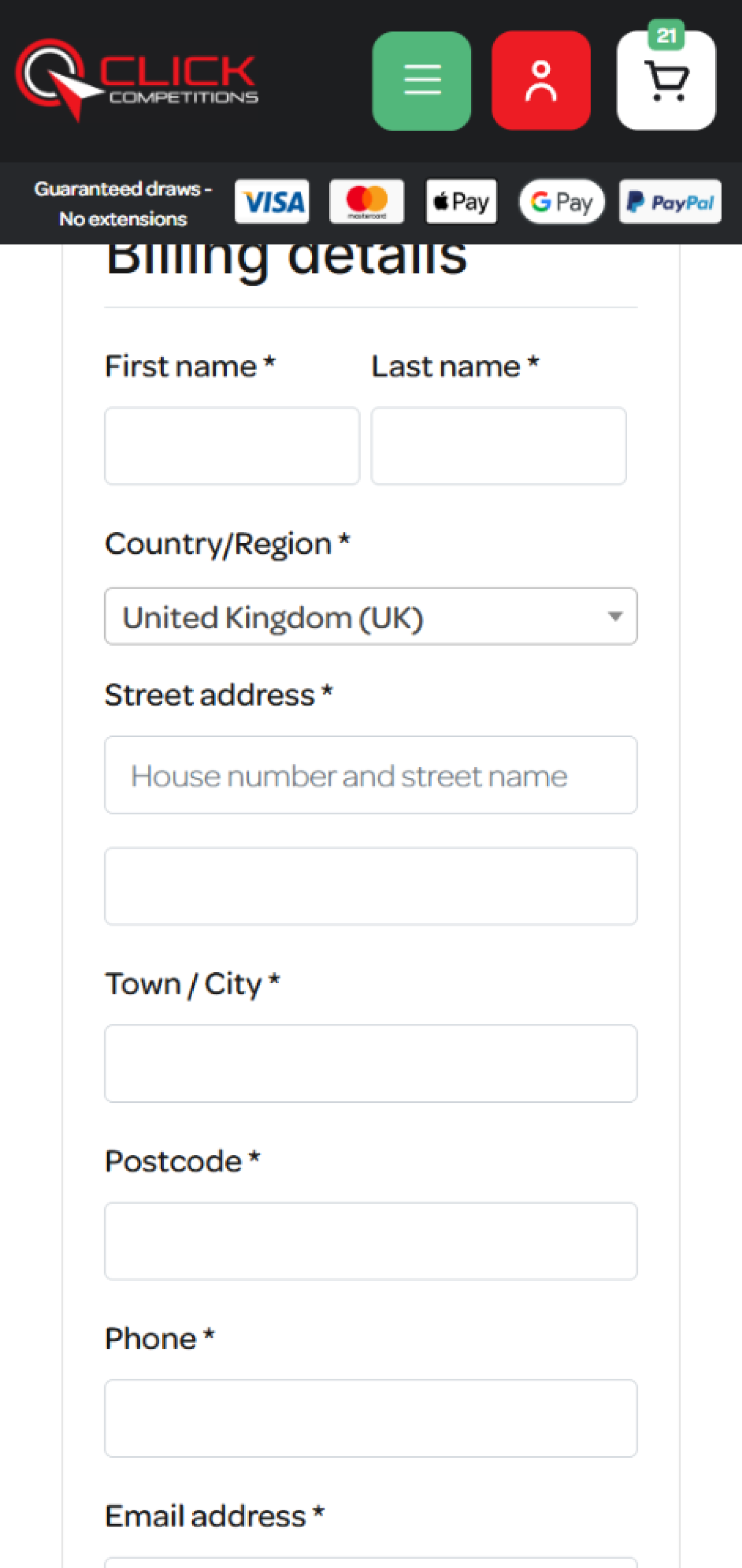
Almost every flow had flaws, and checkout was the worst of them: a bulky five-step path with hidden CTAs that leaked conversions at each handoff. Mobile, the surface most players actually used, was the most broken. And two things players now expect simply didn't exist.
You can rebuild the plane, but it has to keep flying. 220,000 people are on board, and none of them can feel the engine swap.
Full platform migrations usually shed users at the seams, every changed habit is a reason to leave. A live audience this size meant the rework was as much a risk-management problem as a design one.
Existing players have muscle memory. The checkout needed clearer CTAs and far less typing, but the core act of entering had to still feel like Click.
Velocity was a requirement, not a luxury. A design system and phased rollout let us move fast without betting the whole user base on a single big-bang release.
Conversion was the mandate, but a competition product lives on trust. Every friction I removed had to make the right thing easier, not nudge people into spending they'd regret.
With two months and a live audience, prioritisation was the strategy. I reworked the platform end to end, but I ranked the work by conversion and business impact, fixed the biggest leak first, then added the missing capabilities, all on a shared system so the team could build in parallel. The three deep-dives below are the highest-impact slices of that wider rework.
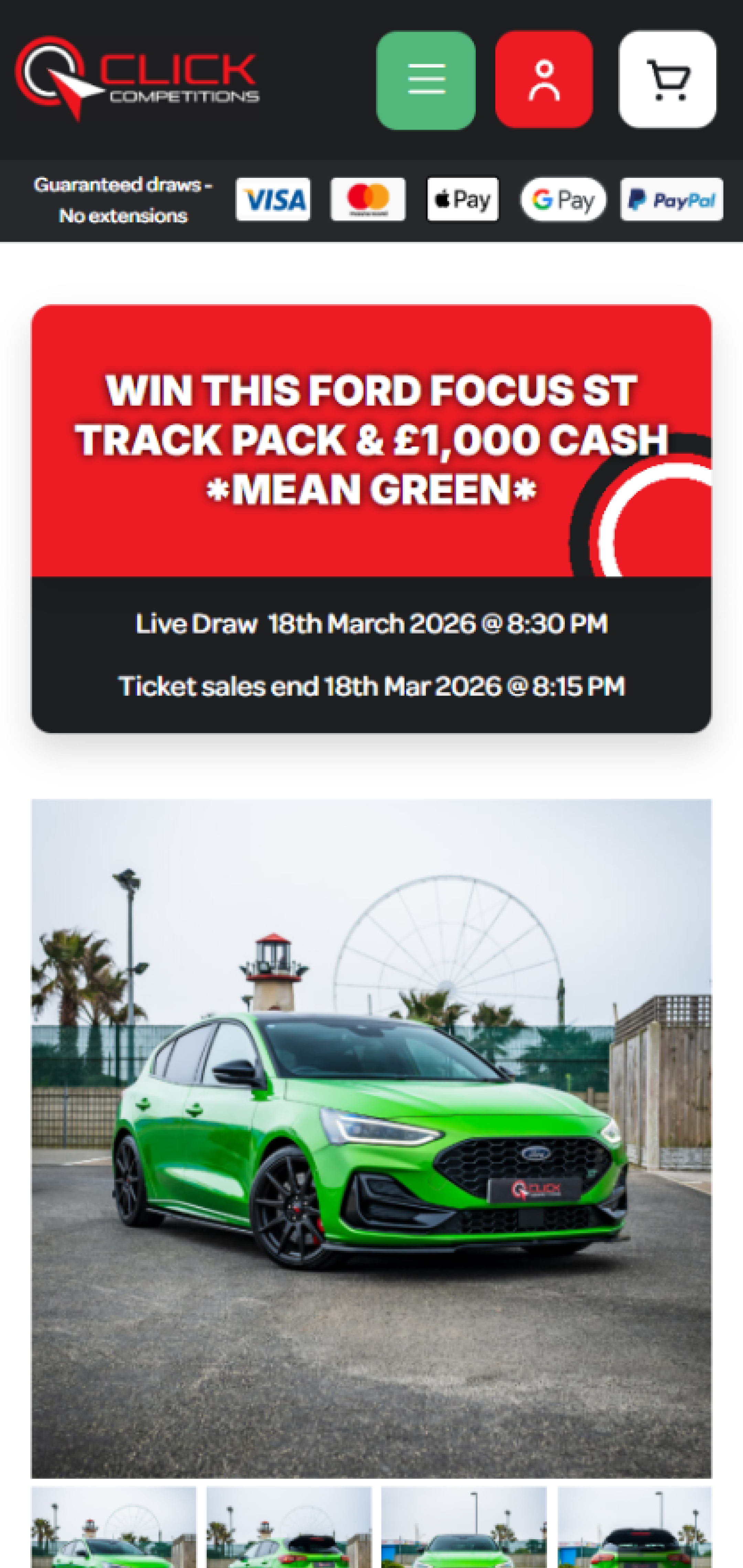
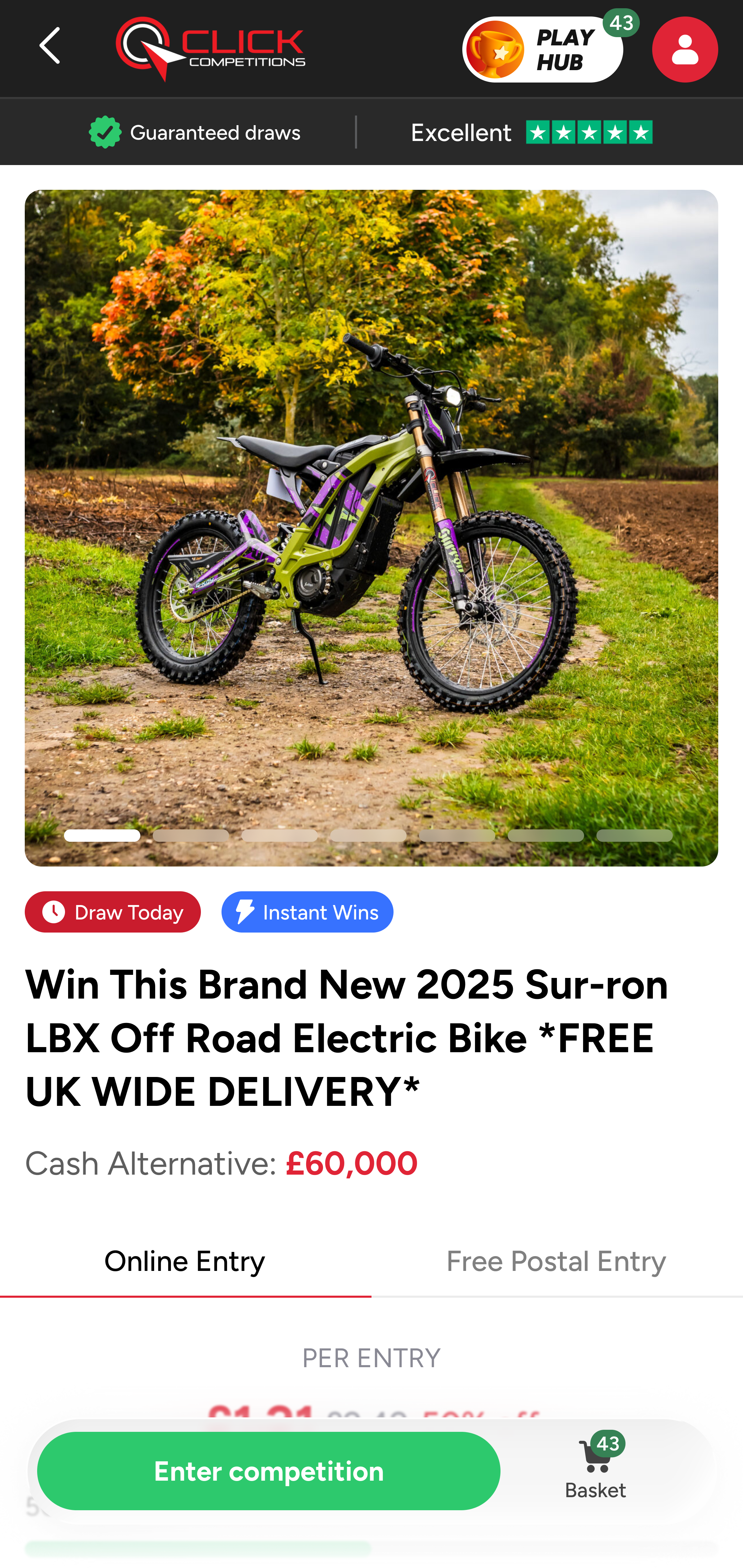
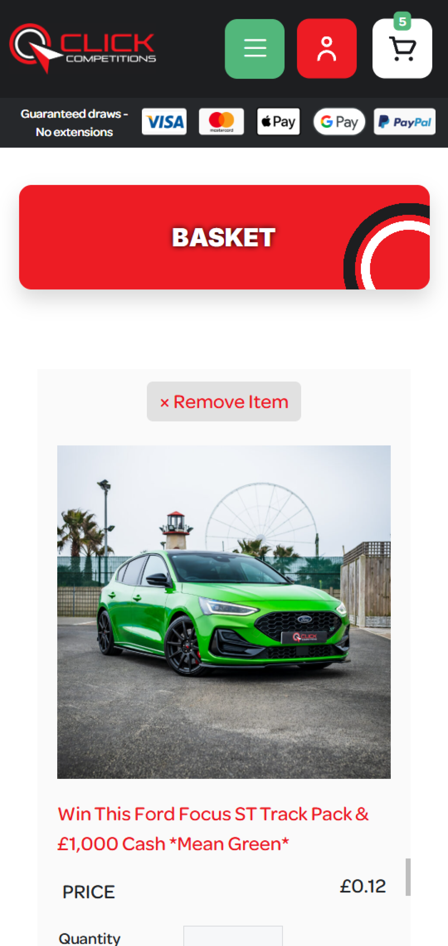
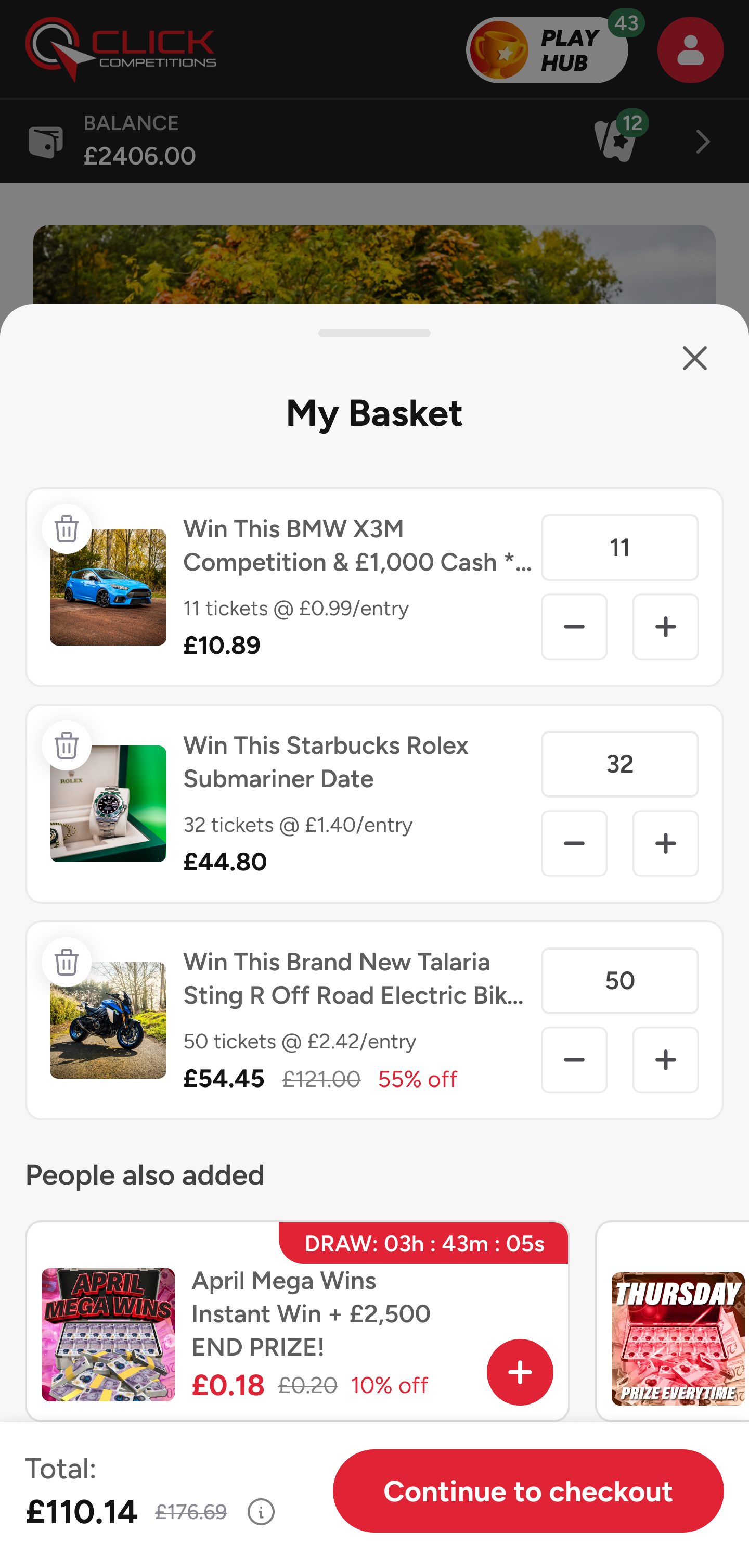
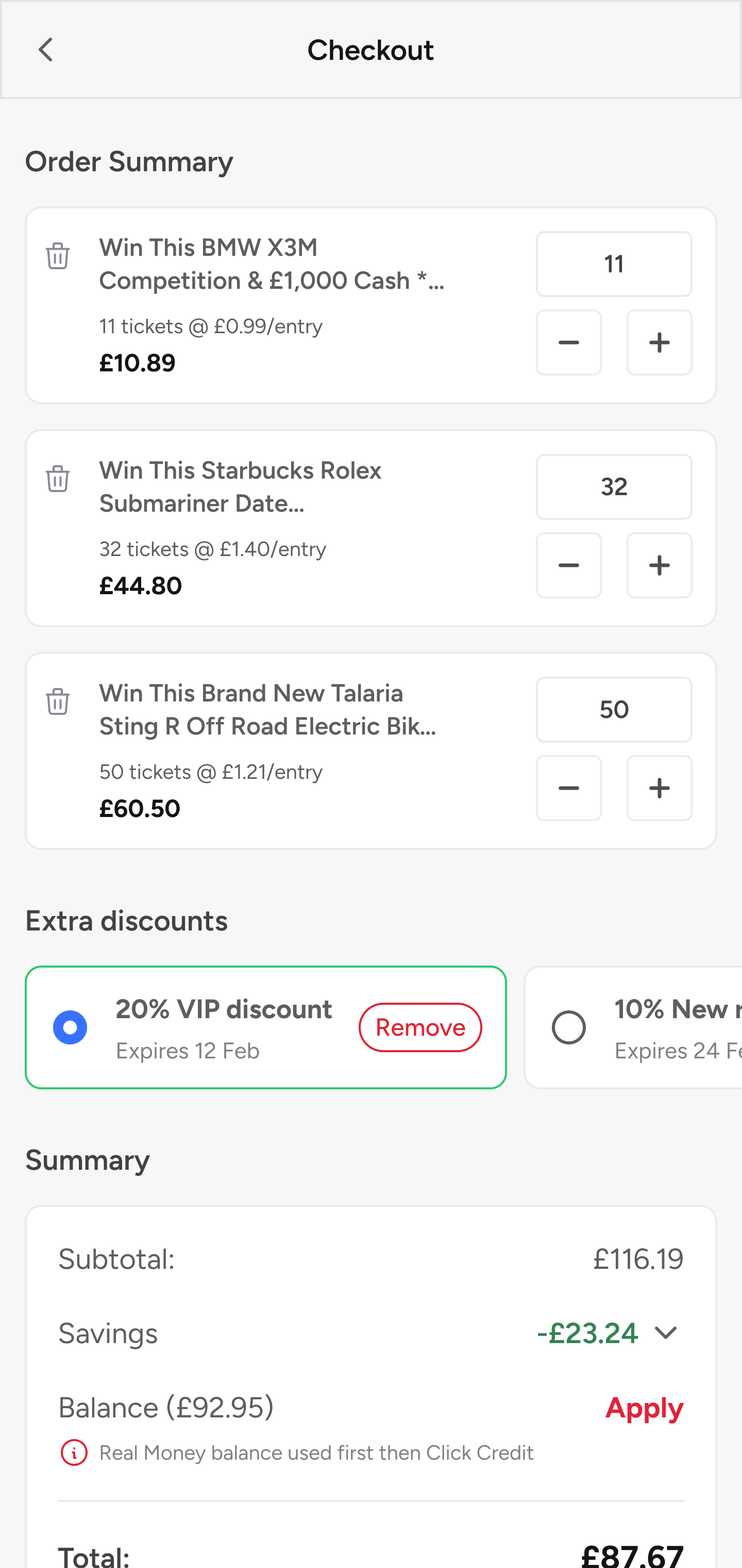
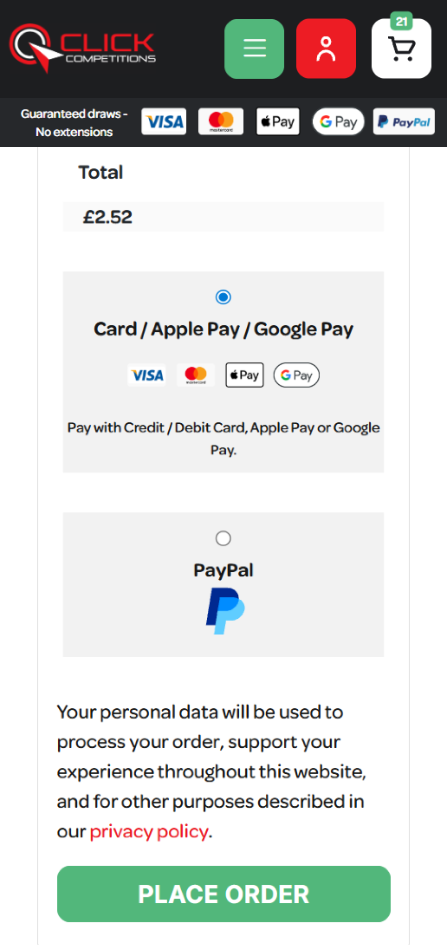
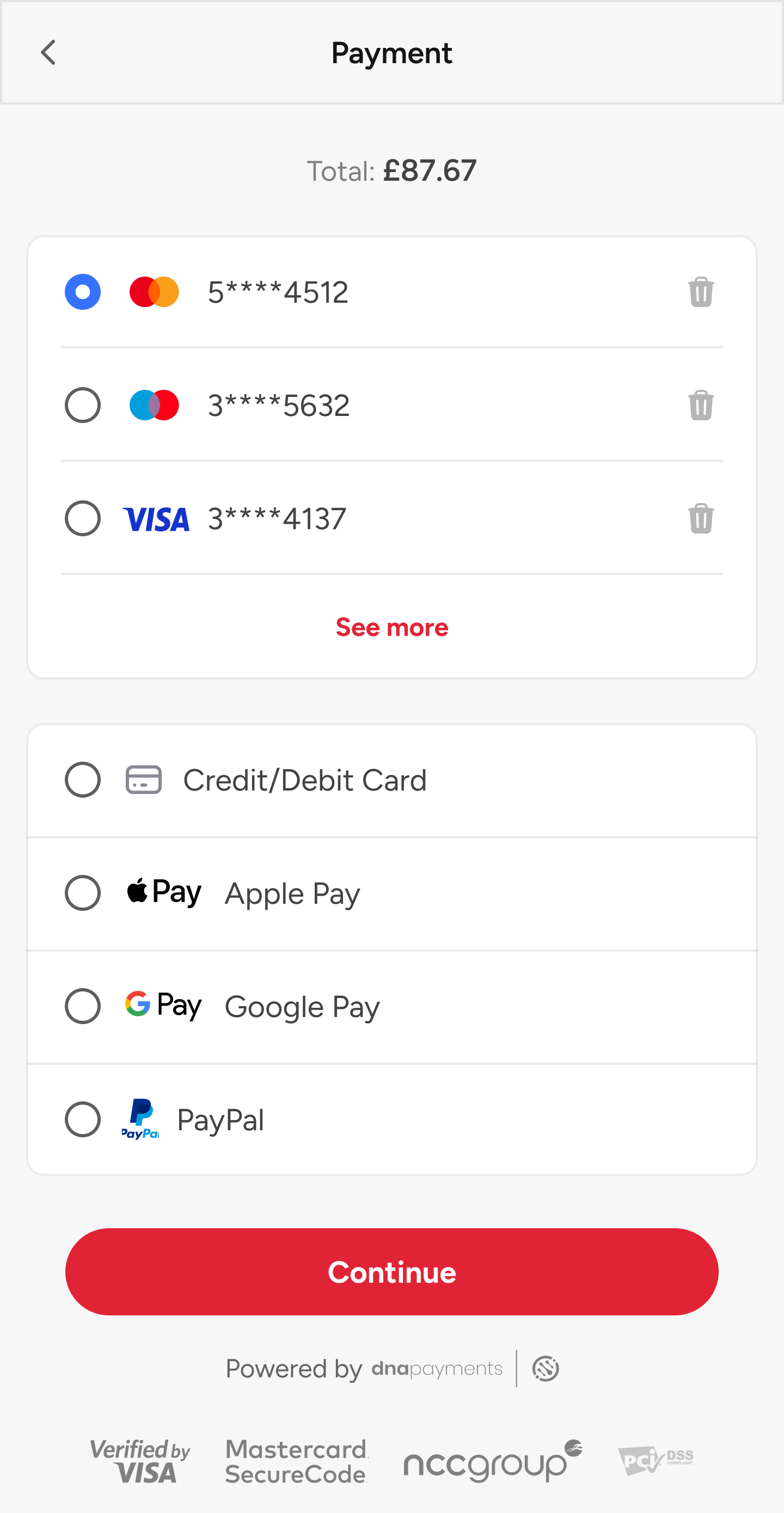
The full path runs lobby → competition → basket → checkout → payment → a success screen that pays off the thrill. I rebuilt each step around one question: what is stopping a player from finishing? Each pair below shows the inherited screen, the reworked screen, and the friction removed.


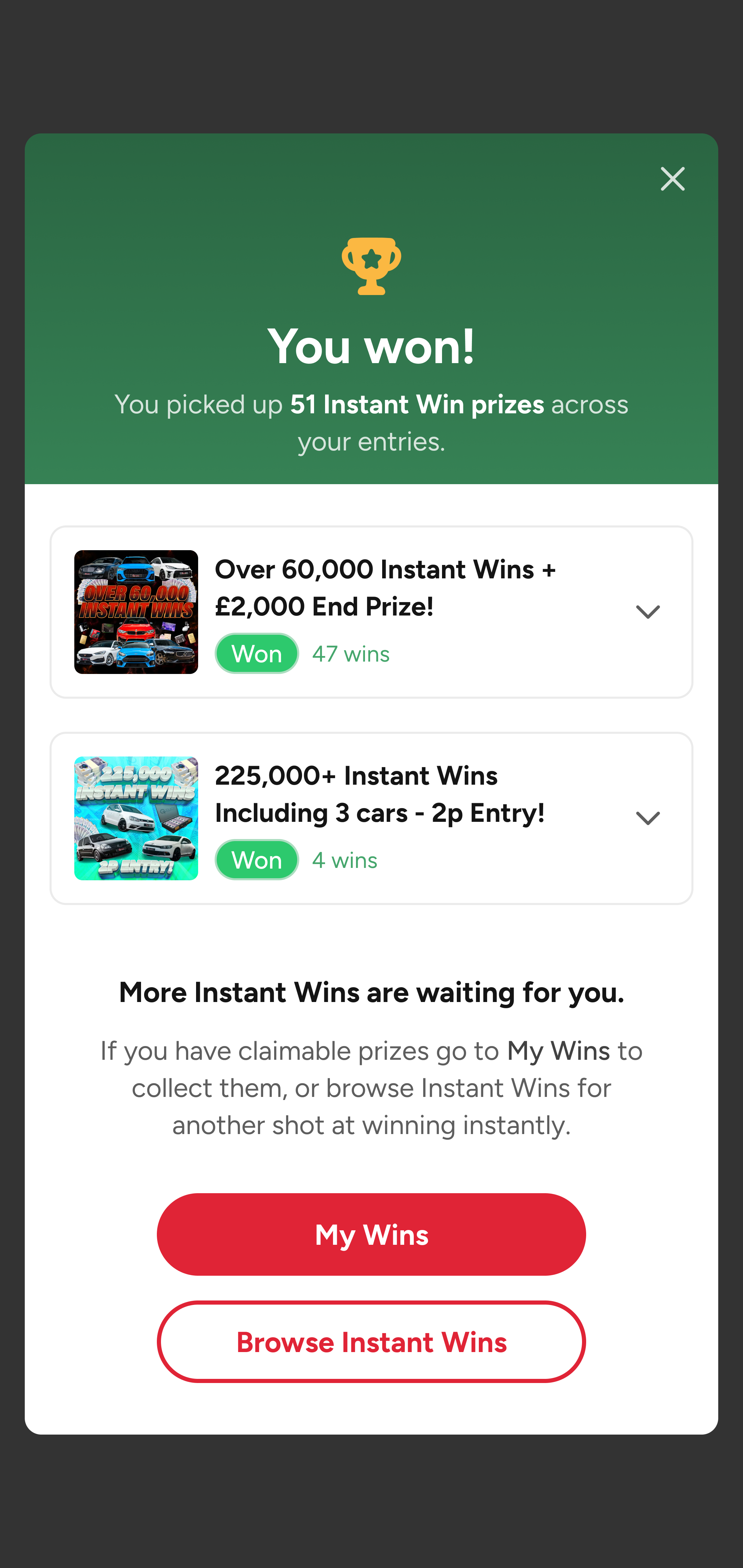
When an order contains Instant Wins, the confirmation leads with a Reveal Instant Win Results button that opens a celebratory “You won!” screen, every instant prize and the winning ticket numbers gathered in one place. Regular-only orders get a clean, reassuring confirmation. Either way it ends by pointing players toward more competitions, turning a finished order into the next one.
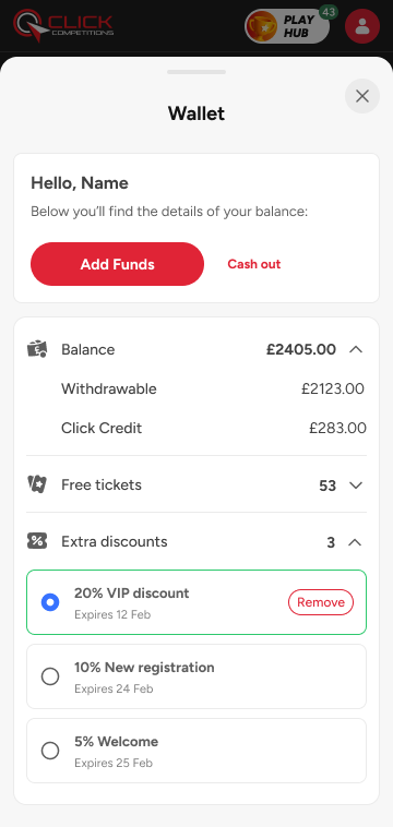
The platform had no concept of a balance. Every entry re-collected card details, and money moving in or out was opaque. I designed a wallet that does three jobs: it makes the next entry effortless, makes cashing out feel safe, and gives players a clear record of everything they've paid in.

One balance that tells players exactly what's real.
The headline balance splits into Withdrawable cash and Click Credit, promotional funds that can't be cashed out. Separating them up front is the difference between a wallet players trust and one they feel tricked by.

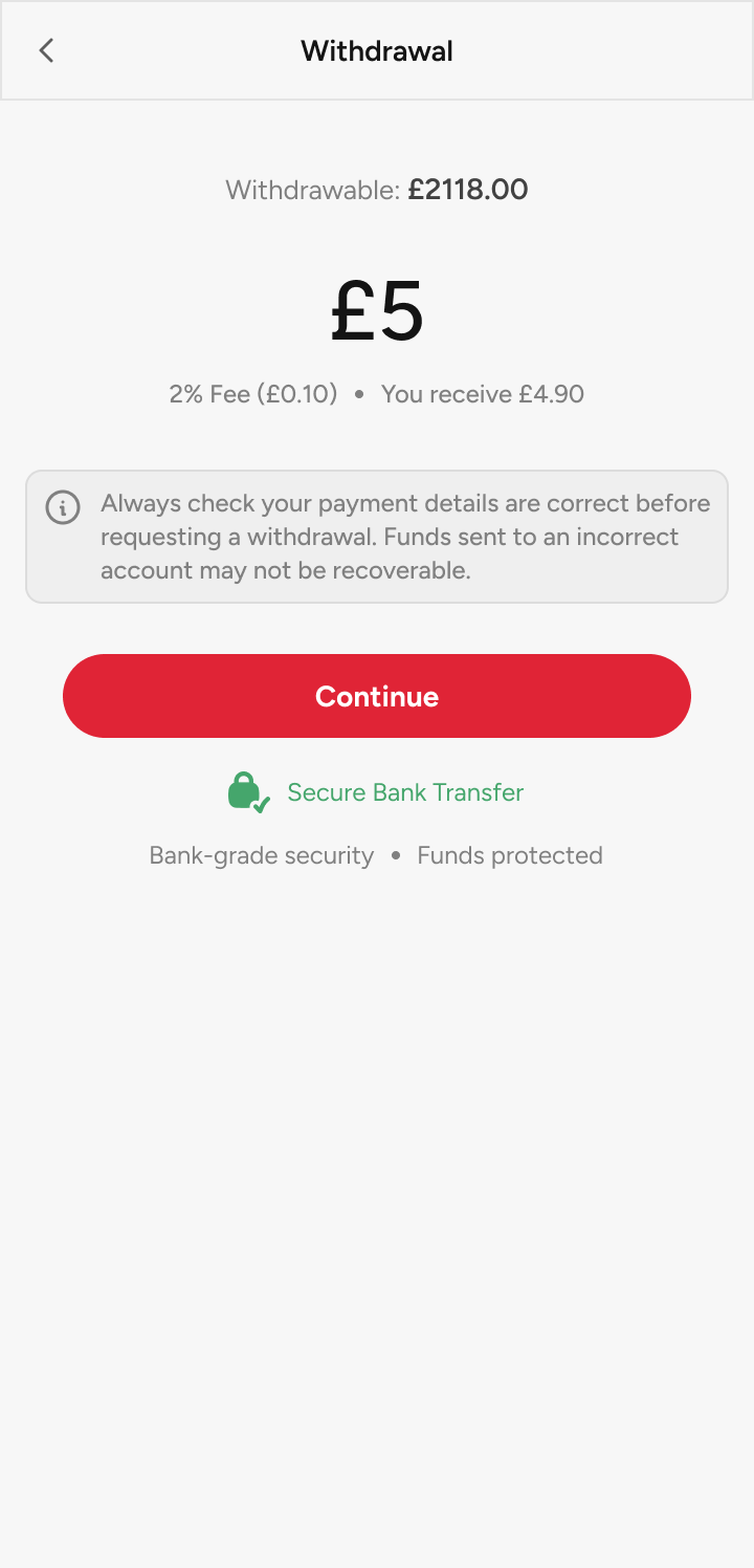
Getting your money out is proof the game is fair.
In a competition product, a visible, self-serve withdrawal is the strongest trust signal there is. The fee is never hidden: players see the 2% deduction and the exact net they'll receive before they commit.

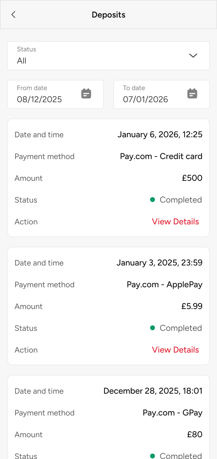
A paper trail that answers "where did my money go?"
Every deposit is logged and filterable, so the question that used to generate support tickets now answers itself. Accountability is a feature, not an afterthought.
Resolving a win used to happen entirely by hand: staff emailing winners, chasing whether they wanted the physical prize or the cash, processing each one manually. I designed a self-serve flow that hands that decision straight to the winner, and quietly gives the business a reason to keep the money in-platform.

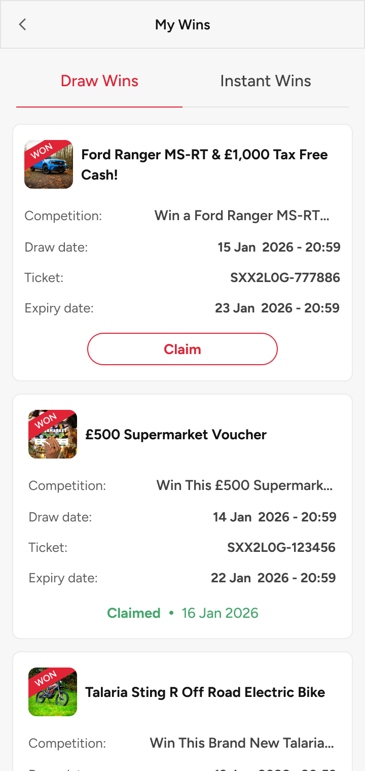
Every win in one place, with a clock on it.
Wins land in a dedicated list, split into Draw Wins and Instant Wins. Each card carries the prize, the winning ticket and a draw date, plus an expiry date, so claiming has a clear, motivating deadline instead of drifting.

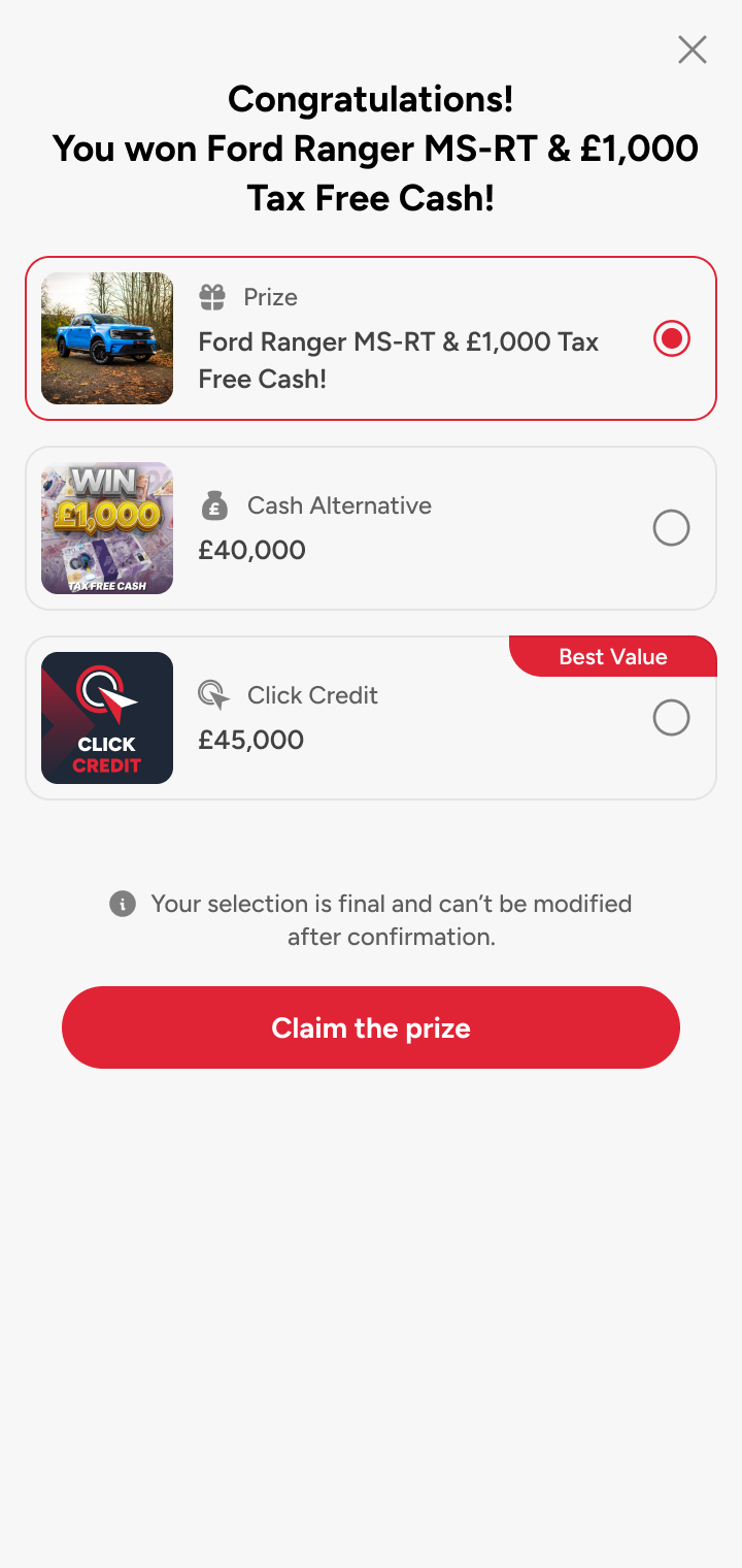
Three ways to take a win, and a reason to stay.
Winners pick from the physical prize, a cash alternative, or Click Credit, and the credit is deliberately worth more (£45,000 vs £40,000 cash on a Ford Ranger win). It's an honest, visible trade that nudges value back into the platform and lifts retention.

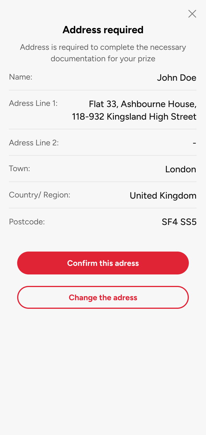
Collect what's needed, nothing more.
Only physical prizes need an address, so the form only appears for those. Details are pre-filled from the account and confirmed in a tap, while cash and credit pay straight into the wallet, closing the loop without a single email.
A rebuild this fast only stays consistent if it's built on shared parts. So before the flows, I built the system underneath them, and it grew far beyond a colour palette and a button. What follows is a fraction of it; the point isn't the inventory, it's that every screen in this case study is assembled from the same governed library.
Tokens feed components, components carry their own variants and states, and patterns compose them into the flows you've just seen. That layering is why checkout, wallet and prize claim could be built in parallel by different hands and still feel like one product, and why the next feature starts at 80%, not zero.
It's deliberately more than this case needs. A platform with 220,000 live users and a roadmap can't be held together by screenshots and good intentions; it needs a source of truth.
active users carried through a full platform migration with zero drop-off. Migrations this size almost always shed people at the seams. This one didn't lose a single user.
We added a step, not removed one. The extra beat is a bundle upsell that lifts basket value, and completion still climbed to 85%. More steps, less friction.